Assignment 3A -Checkpoint 5 - Polish & UI
Last Checkpoint -
Finally, I have reached the final checkpoint in the for the unit regarding devlogs and before the final submission, and lots of progress has been made, but that does not mean there is still not more work to be done. For starters, due to writing my schedule down incorrectly, I had missed the final feedback tutorial, and just barely made the testing session today, so unfortunately, I have no notes to go off for the polish and UI. I did however, receive several notes during the testing session, that greatly informed me off the UI aspect and how people felt about the look of levels. Due to feedback being given through Google Docs anonymously, I cannot quote any one person, but can write down the feedback given related the game itself.
UI Feedback -
Bits of feedback mention: "Checkpoints could maybe change colour or indicate that you reached it?" in reference to the little blue slime that serves as a checkpoint. While he is obvious on screen, it is not obvious when the player has set themselves as the him for the respawn point. Therefore, a future change will be to include a colour change for ease of the unknown of not knowing where someone will go when they die.

Another note mentions that they were unsure as to when they were dashing, as the animation would cut out. Same with the future of the checkpoint, a future feature for the UI will be making the slime on top of the head change colour as well, signifying a dash action.
Speaking of animation, I have still yet to perfect it, but from the feedback of the testing session, lots of players were quite happy with it, saying: "Animations and movement are fluid! Love it." and "very smooth and I liked the animations". So, while I might still kick myself over it not properly transitioning from double wall jump into dash, the players are still enjoying themselves nonetheless.
Polishing Up -
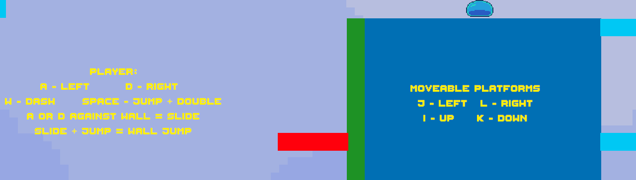
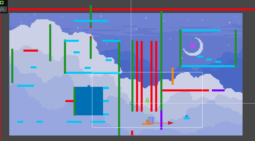
Polish wise the game could still do with some fix ups, as while the style and art during the live testing was said to look nice and level design was enjoyable (while a bit too difficult at times) there are still some blocks that either phase behind others, don't line up properly, or don't blend well color wise with the background. Therefore, before the final submission, I will focus on these aspects. I did also implement Text to be displayed in the tutorial section for the players to understand all controls, not only with player movement but also player-controlled platform movement, this was a majorly needed item as in the last feedback collected, players found it hard to get past a section of the game, only to realize that they could move the platforms all along!
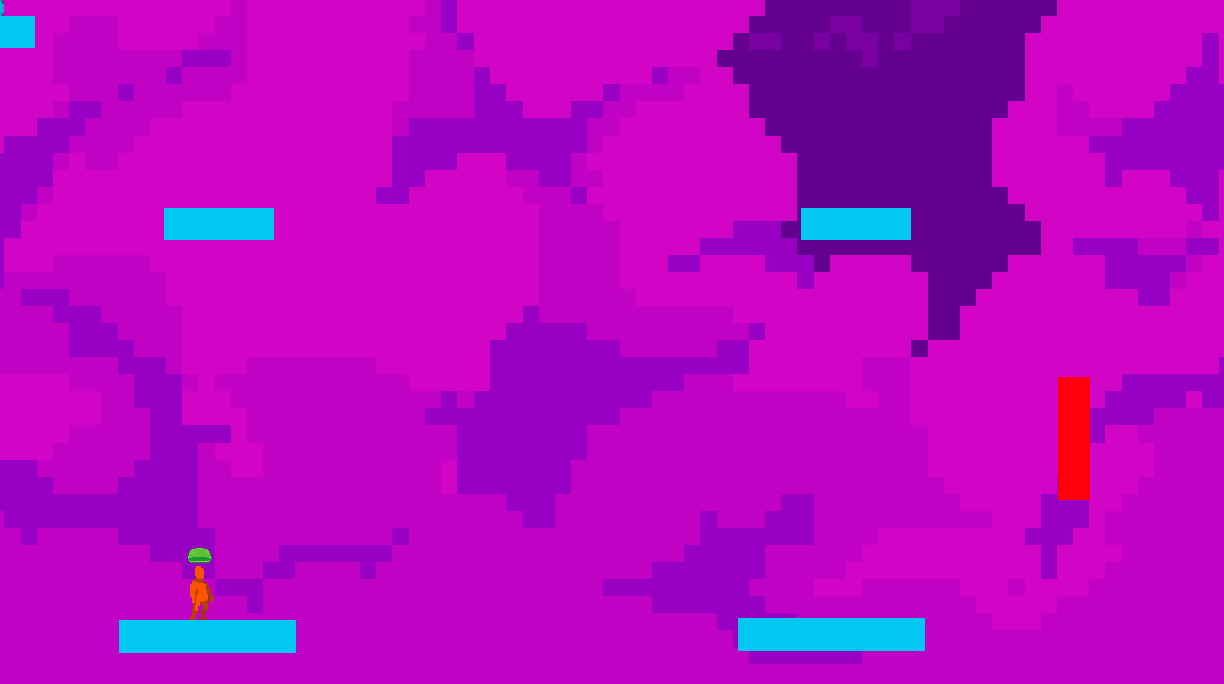
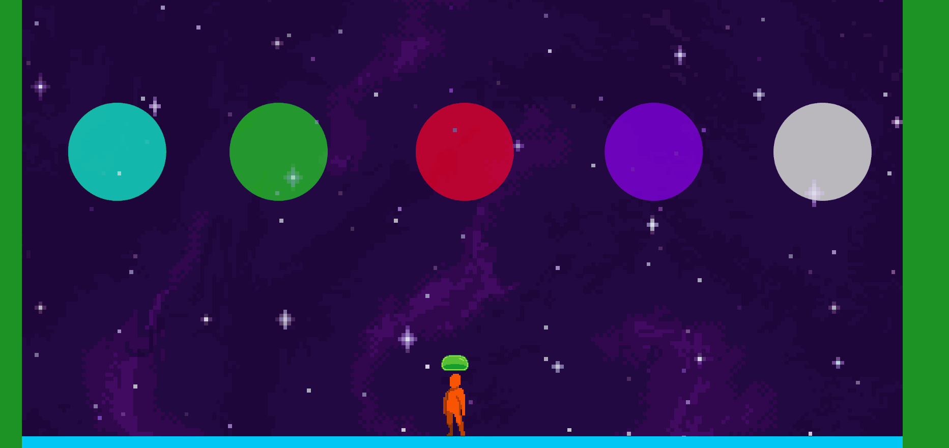
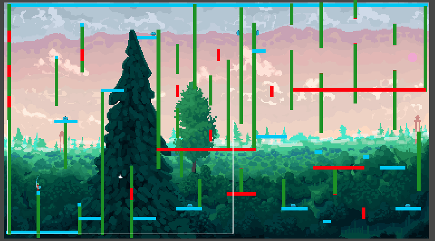
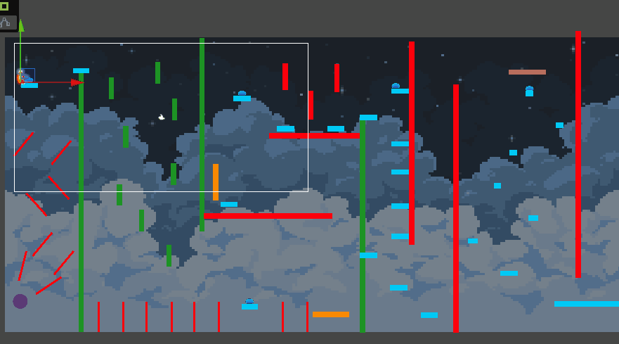
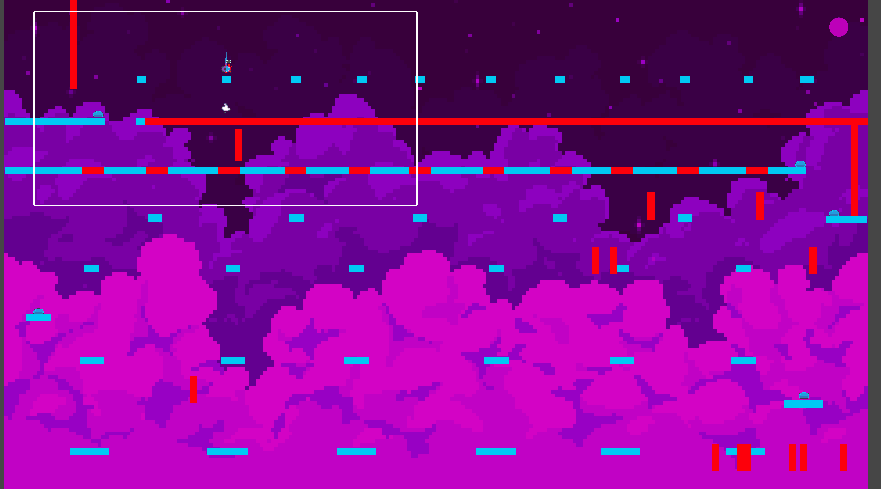
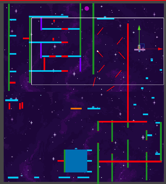
With the levels as well, each one has been "completed" there will be some final touch ups and some levels being made easier or more forgiving, but here are all the new and improved levels in order of Portal Room, Tutorial, Level 1, Level 2, Level 3 and Final Level:
Camera Fixes -
The camera was also adjusted and fixed for Itch.io, and was zoomed at in certain levels to allow the players to see all they needed for the navigation in the level,

however, some players did also leave some feedback about how difficult some of the levels are, so for the future, I might dial back some of the difficulty levels for each of them
Final Note:
All in all I am quite happy with the progress made and the feedback given, and hope to have a fully functional and fully released game by the end of this unit.
Leave a comment
Log in with itch.io to leave a comment.