Assignment 3A -Checkpoint 4 - Presentation & Graphics
Presentation & Graphics
This week’s checkpoint was all about presentation, however, I still had some feedback I wanted to work on first before diving into the look and consistent style of the game. Therefore, I dove into controller support. It did not go well.
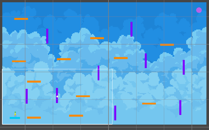
Getting controller input to work properly required a deep dive into Unity’s Input System and action maps. Builds saw the controller causing weird behavior, causing jump inputs to be getting eaten, and player movement locking up altogether. After a grueling couple of days I had to shelf the concept for the moment to focus on the look of the game first, and come back to the controller later. One of the pieces of feedback I got last week was that platforms weren't consistent with their colors on how they interacted with the player, so I added in more consistent colors so it is more readable between levels. Another aspect I cleaned up was the death zones as well, as mentioned by some private feedback, as unfortunately, I was unable to attend this weeks tutorial.
Visual Cleanup: Death Zone Overhaul
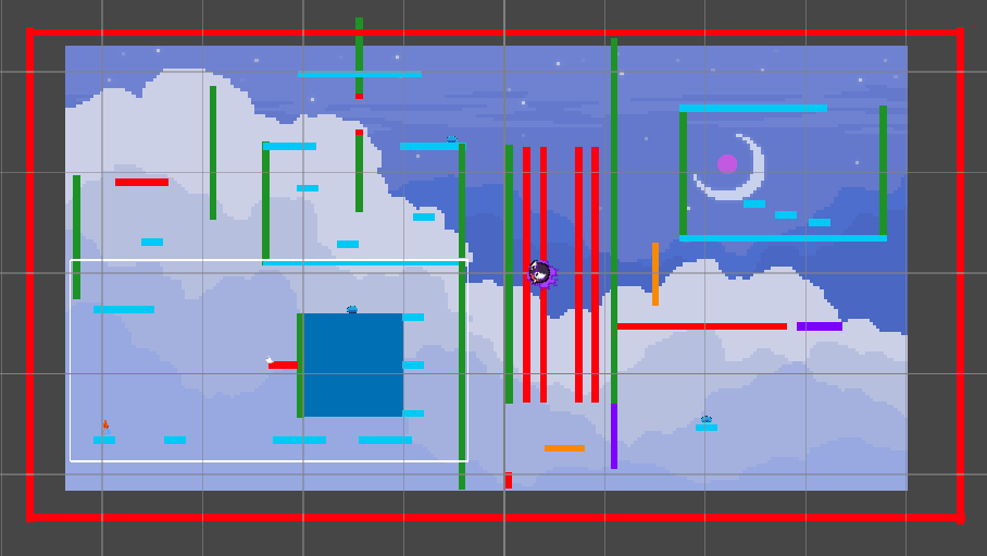
One of the biggest visual eyesores in previous builds was the overuse of red Death Zones. While they served their purpose by resetting the player when touched I had placed them too aggressively and they were visually jarring. Worse, they created a boxed-in feeling that clashed with the freedom of movement I wanted to encourage.
I ended up removing or redesigning many of them, replacing some with more subtle hazards and giving others better spacing in the level layout. This not only cleaned up the visuals but improved gameplay flow. I want players to now have room to explore and experiment without constantly being punished.
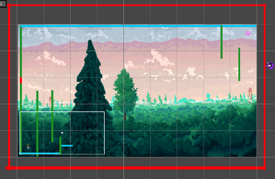
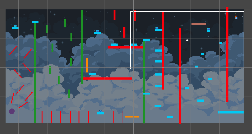
Level Design: A Cleaner, Clearer Experience
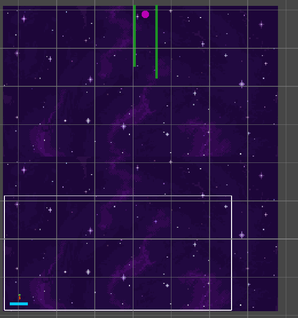
In addition to removing clutter and harsh visuals, I also worked on overall level readability. Several platforms and background elements were adjusted to make navigation more intuitive. I want players to understand the level at a glance, where they can go, what might be a hazard, and where creativity might reward them. All the following levels are all works in progress and hopefully follow the pixel style I hope to achieve.
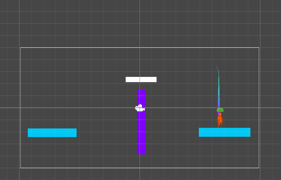
Preventing Off-Screen Chaos
A big issue I had with player controlled platforms as well was that they could move as far as they wanted. But the goal was to have them be ranged.
To address this, I implemented movement boundaries on player-controlled platforms and character motion. Now, even with wild maneuvers, the platform stays within the screen limits and set ranges, making gameplay easier to follow and more visually stable. However, there is still stickiness issues, present in the following figure.

Final Thoughts
This checkpoint made me realize that presentation is as much about what you remove as what you add. Removing clutter, calming visual noise, and fixing the way players interact with the game all contributed to a more polished, playable experience.
Next, I’ll keep refining the controller setup and continue building out levels.
I will ensure next tutorial I will gather feedback from all students and not just privately inquire through known persons, as well the feedback was helpful, peer-assessment is vital to recognizing flaws that others might not.
Leave a comment
Log in with itch.io to leave a comment.